- This topic has 6 replies, 3 voices, and was last updated 12 years, 1 month ago by
support-michael.
-
AuthorPosts
-
paulDMemberHi Everyone
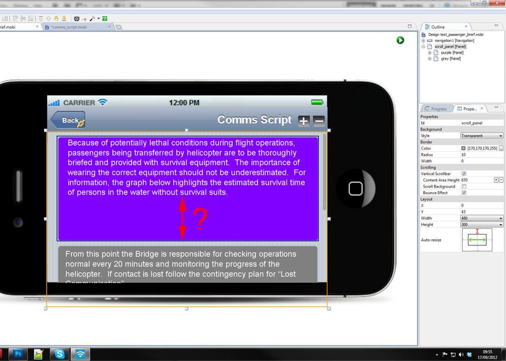
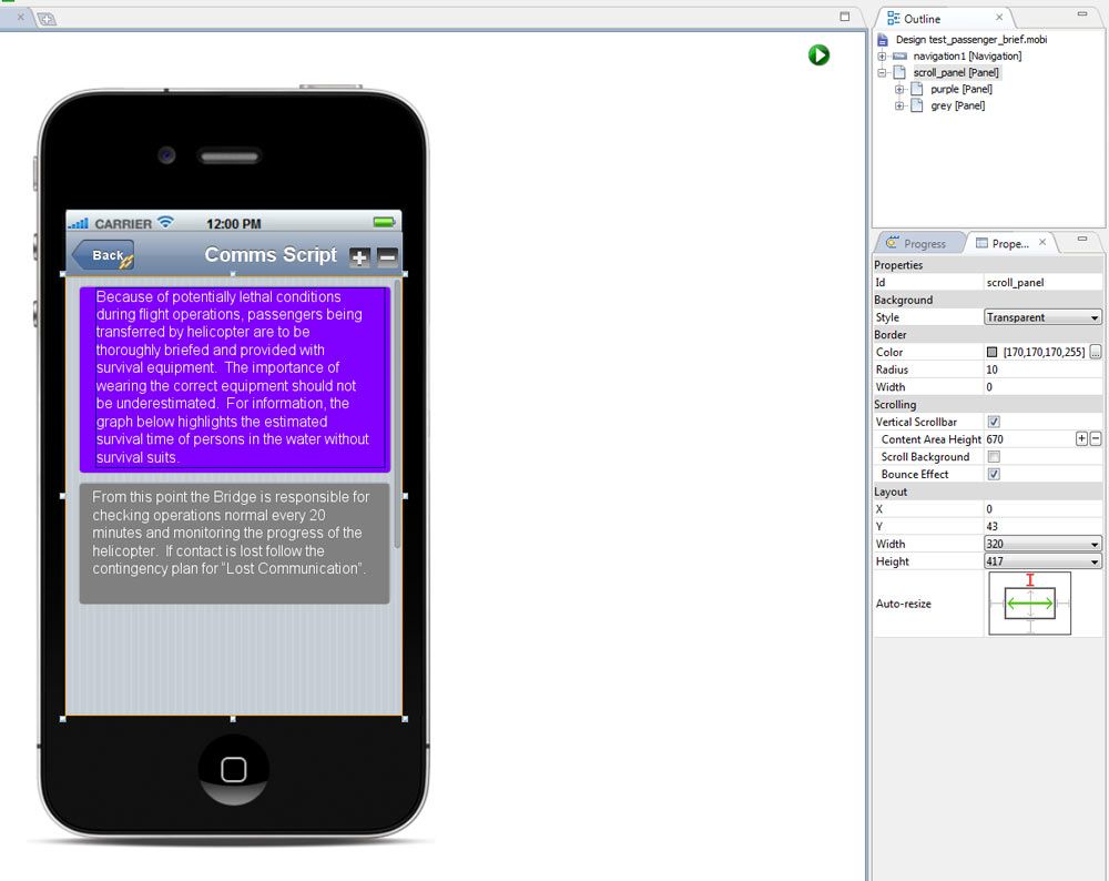
I wonder if anyone could possibly help with some advise on how to resize widgets properly between landscape and portrait screen orientation. I’ve got a simple screen with a scroll bar panel and a couple of coloured panels which i am using as just place holders for text boxes. Nothing fancy
The problem is when i switch to landscape the coloured container panels hight does not resize properly. I’ve looked at the advanced UI design tutorial and no matter what setting i use for the layout i just cant get it to work. Its probably something really stupid I’ve missed or misunderstood. I’ve tried setting the height to auto fiddled with every setting in the resize until my fingers have dropped off with no avail.
Here are some screen shots


paulDMemberNo Help with this?
Poor form Mobione. I bought a licence of your product and it told me it comes with free support. Even if i’m being a complete divvy and missed something obvious in the instructions you could at least take 2 seconds out and tell me.
Anyway in the end I had to change the design of the app to use portrait only as I can’t for the life of me see a way around this. I finally got my little app on my ipod and all in all pretty pleased with the result. I have found out that doing anything relating to apple development is not easy no matter which application you use to build your apps.
Getting your apple developer licence sorted is easy and fun as hacking your manhood off with a rusty bread knife.
support-michaelKeymasterI was trying some diff approaches. The net issue as you have identified is that the panel widget is independent of its contents and will not automatically shrink around it contents if they change ht or width.
paulDMemberHi Wayne
Not a problem and I apologise for the harshness of the post. next time maybe just say I’m looking into it? Seeing my post go unanswered for 5 days is pretty sucky.
Anyway thanks for getting back to me, I thought it was something to do with that. In the end I’ve had to select either portrait or landscape for the final app and design the pages around that. The scrolling panel in particular has issues with resizing when it has content within it. Any work around would be much appreciated as its pretty much what I need to use for my projects.
I am trying to build a kind of book type manual with multiple pages which need to scroll as I don’t want to end up with loads of screens. I’ve built a prototype and it works really well but having the ability to turn the screen would be very good. I want the user to be able to click on a image which brings it up full screen, but because of the aspect ratio of the image it looks much better landscape.
Thanks
Paul
support-michaelKeymasterNo apology required, I let this problem simmer on my plate for a few days along with a pile of other things on my todo list. Octavio pinged me about it after realizing it was grossly tardy. My BAD!
I’m thinking about your specific layout requirement and will be presenting it to the dev team early next week. I have been thinking about some coding techniques that may be automatable… still investigating…
philipeftMemberHi Guys,
I have exactly the same problem. I thought it was be being dumb, so its good to know that others have identified the same issue.
I note that the same problem arises when you view the site on different devices. eg: iPhone Vs iPad
Anyway, I just wanted to add my weight to the request that something be done to fix this.
Thanks,
Philip.
support-michaelKeymasterWe understand the problem and are investigating how we can best address it. In a nutshell the requirements are for a container that collapses around its contents and when it collapses other containers such as your lower panels will maintain relative positioning. We don’t have a quick solution identified yet.
-
AuthorPosts

